100,000 Bottles of Beer in the Wall
Alfred Heineken’s recycling program
Paul Collins
I saw Tom Kelly’s house many years ago; I was with some friends, spending spring break poking around Death Valley for really no good reason at all. It was across the Nevada border that we found Rhyolite, an old mining town that had 10,000 inhabitants at its height. But that was before the silver ran out. Now Rhyolite is as empty as an old beer bottle—or so we thought. When we approached the old Kelly house, we were in for a surprise. STAY AWAY, read the letters painted across the roof. A survivalist array of vehicles was parked out front; we noticed, around our feet, a number of rusted cans pitted with buckshot. Then we fled.
And that was too bad, because I really did want to see inside that house. Its walls consisted of 51,000 bricks, of a sort—bricks that once held Busch Beer, scavenged from the town’s hard-drinking saloons while the house was being built in 1905. It was a house built of beer bottles. Such houses exist across the US, though demolition and earthquakes have shattered a few of them. The house built by saloon keeper Tom Kelly is an intriguing example, because unlike most builders, Kelly didn’t bother to wash out his bottles first. Water was too precious in Rhyolite for such niceties. Beer, on the other hand, was everywhere. Dipsomania is a boon for such builders: a similar honeycomb-like structure of bottles and mortar, built by a pharmacist in Hillsville, Virginia in the 1940s, was nicknamed The House of a Thousand Headaches for all the hangovers it held.[1] But any container will do, really: in Post City, a turn-of-the-century Texas town founded by an eccentric breakfast cereal tycoon, one Edwardian home featured a fireplace built of blue snuff bottles.[2]
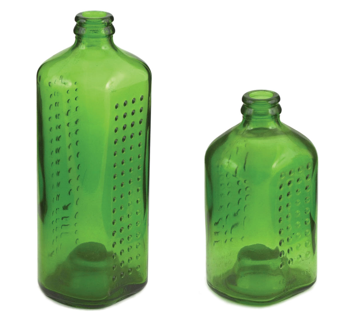
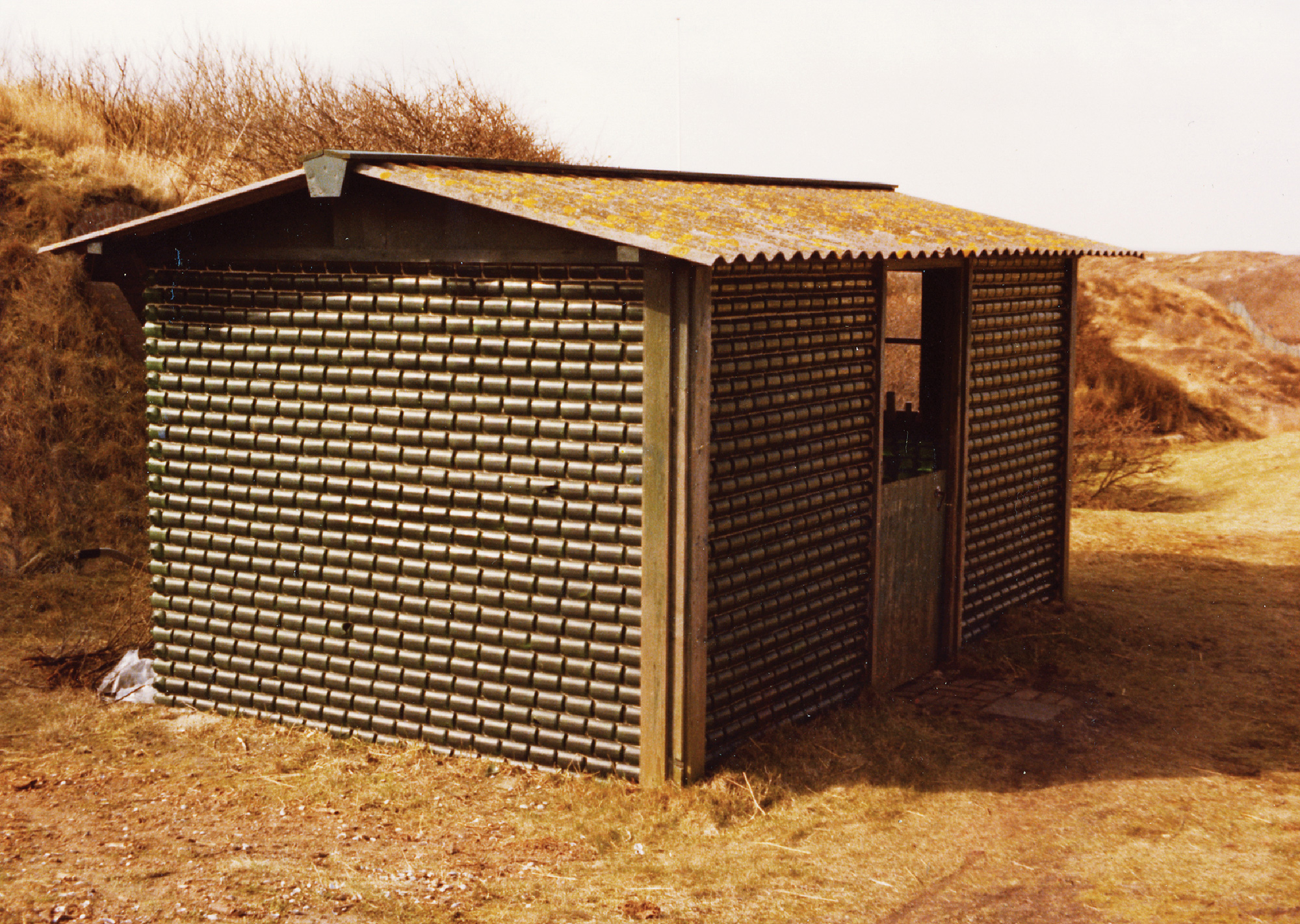
These were scattered efforts, the stuff of local oddball anecdotes. But there was once a serious attempt at mass-producing houses from bottles: the WOBO (World Bottle). Had it worked, untold thousands in developing countries would wake up each morning under an unearthly glow: sunlight filtered through dark green beer bottles.
• • •
In 1960, brewing magnate Alfred Heineken was visiting Curaçao, off the Venezuelan coast, when he noted with dismay the acres of trash underfoot—a good part of it produced by his own company. Heineken Breweries had an efficient bottle-return system in Holland, where the average bottle was used 30 times before being discarded. But without modern distribution, bottles in Curaçao were used once and thrown out. There was no lack of resulting trash: what the island did lack, however, was affordable housing. Heineken had a flash of brilliance: make beer bottles that you can build houses out of.
Rather than the eccentric form of American bottle houses—where the containers, mortared in parallel to the floor, created walls bristling with open necks—Alfred Heineken imagined less a beer bottle reused as a brick than a glass brick that happened to hold beer. Wash them out and slap on some cement: instant stained-glass shantytown. Heineken’s WOBO was, notes Martin Pawley in his 1975 history Garbage Housing, “the first mass production container ever designed from the outset for secondary use as a building component.”
Back in Rotterdam, Heineken contracted architect John Habraken to redesign bottles into a buildable container. A beer bottle standing upright is, surprisingly, up to code, bearing 50 kg per square centimeter. But bottles are not easily vertically stacked. Laid on their side, though, they crush too easily. Habraken’s solution was to develop vertically stackable Chianti-like bottles with long necks and recessed sides that nested into and supported each other. It was a brilliant compromise, but Heineken’s marketing department rejected it as “effeminate”—a curious description considering that the bottle consisted of two bulbous compartments surmounted by a long shaft. We can only assume that Habraken did not anticipate why the men of Curaçao might not want to hold this up to their lips.


• • •
A press release on Heineken’s website trumpets their latest packaging innovation: sleek aluminum bottles, developed by Heineken Brasseries of France. It is a handsome, striking design. “The objective was to attract young adult customers,” we are told. “Brasseries Heineken guarantees its exclusiveness through limiting both its availability in outlets and the number of bottles.” The release then matter-of-factly notes that “the consumer price was high,” and that such designs are “suitable for dimly-lit outlets such as clubs.”[4] Well, that’s where the money is.
It is, perhaps, asking too much to expect a beer company to provide housing for the developing world. That Heineken ever even contemplated it already sets them apart from virtually every other manufacturer. Yet the WOBO concept continues to haunt designers. Two decades later, in 1979, an International Conference of Garbage Architects was held at Florida A&M, attracting such notable participants as architect Witold Rybzcynski. In 2002, the WOBO was cited among the best 100 consumer product designs in the Phaidon Press collection Spoon.[5] But the most curious tribute to WOBO came recently with the Eco/Ergo Bottle, developed by Esther Ratner, Associate Professor of Industrial Design at Arizona State University.[6] Ratner reimagined WOBO as a vertically oriented container with an ergonomically curved grip. Unlike WOBO, Ratner even found a use for the cap. “If used as a building material, the bottle is designed to use a small sphere the size of a marble as a spacer,” she explains in an email. “In the next iteration I am looking into a cap design that incorporates a sphere that could be removed for use as the spacer.”
Structural strength is the obvious appeal of Eco/Ergo’s vertical design. But what also led Ratner away from the brick-like form, she says, was simple aesthetics: WOBO was simply too ugly. “I tried one design which was still the boxy horizontal orientation,” she explains. “However, my design had indents along the sides for better grip to accommodate pipes and wiring to run through the bottle walls. But it was still ugly.”[7]
• • •
Ugly or not, there has always been de facto reuse of even the plainest containers. Stolen milk crates were so universally beloved as student furnishings that manufacturers finally woke up and started selling them new and sans the tell tale dairy stenciling. Emptied-out Maxwell House coffee cans have an unassailable place as nail bins and turpentine jars at American workbenches; innumerable Flintstones jelly jars were reused as drinking glasses in the 1970s; and one can hardly guess at how many Altoid peppermint tins have become stash boxes. Reuse even occurs, in spite of their marketing department, with Heineken’s standard containers. In my closet is a lunchbox cleverly made of flattened Heineken beer cans—a contrivance that a friend of my wife’s found in Mali and Senegal.
Manufacturers tacitly understand this reuse: back in the 1930s, American milling firms sold flour in colorfully patterned sacks, because they knew that poor families would reuse the sack cloth for clothing.[8] But millers weren’t including sewing patterns with their sacks. The crucial difference with WOBO was its stated intent: these bottles were specifically designed for reuse, to the point of including blueprints. One can see why a beverage giant’s legal department would become nervous. What if a bottle house collapsed? Would brewers get socked with lawsuits every time an earthquake hit a poor city, or whenever a badly mortared bottle fell and hit a passerby?
Without indemnifying a brewer, it would be very hard for it to answer these concerns. Were WOBO to be made now, it might have to be without instructions, without obvious sanction for reuse. It might need to appear, in other words, like virtually every other object in consumer packaging. Its secondary use would be surreptitious but slyly implied. Considering the perversity of human nature, I think this could be achieved with the following notice on its label:
NOT FOR USE AS A BUILDING MATERIAL.
- There is an extensive site on Bottle Houses at www.agilitynut.com/bh [link defunct—Eds.]
- Charles Dudley Eaves and C. A. Hutchinson, Post City, Texas: C.W. Post’s Colonizing Activities in West Texas (Austin: Texas State Historical Association, 1952), p. 54.
- WOBO’s history is recounted in two books: pages 17–34 of Martin Pawley’s Garbage Housing (London: Architectural Press, 1975), and on pages 97–98 of Nigel Whiteley’s Design for Society (London: Reaktion Books, 1993).
- “Rare and Exclusive: New Aluminum Bottle is Groundbreaking Packaging Innovation.” Press release dated 13 June 2003, at www.heinekeninternational.com/library/ articles.jsp [link now redirects to www.heinekeninternational.com—Eds.].
- Spoon (New York: Phaidon Press, 2002), p. 418.
- The Eco/Ergo bottle is described in “Building a Better Bottle,” at www.3dgate.com/techniques/001030/1030razdan.html [link defunct—Eds.].
- Email interview with Esther Ratner, 12 October 2003.
- Forrest Wilson, “Building With the Byproducts of Society,” AIA Journal, July 1979, p. 41.
Paul Collins edits the Collins Library imprint of McSweeney’s Books, and is the author of Banvard’s Folly and Sixpence House. His newest book is Not Even Wrong.