Colors / Orange
Why not YR?
Michael Rossi
“Colors” is a column in which a writer responds to a specific color assigned by the editors of Cabinet.
Orange is unsettling. An awkward hybrid of adjective and noun, the word upsets the quintessentially modern distinctions between objectivity and subjectivity, nature and culture, public and private. To name a color is to concretize a mental activity. There is no thing in the world called red, nor green, blue, yellow or any other spectral color. Alone among basic color terms, orange denotes both sensation and thing. And thus, alone among basic color terms in English, orange muddles the distinction between thinking and being—between that which can be conceived, and that which ostensibly is.

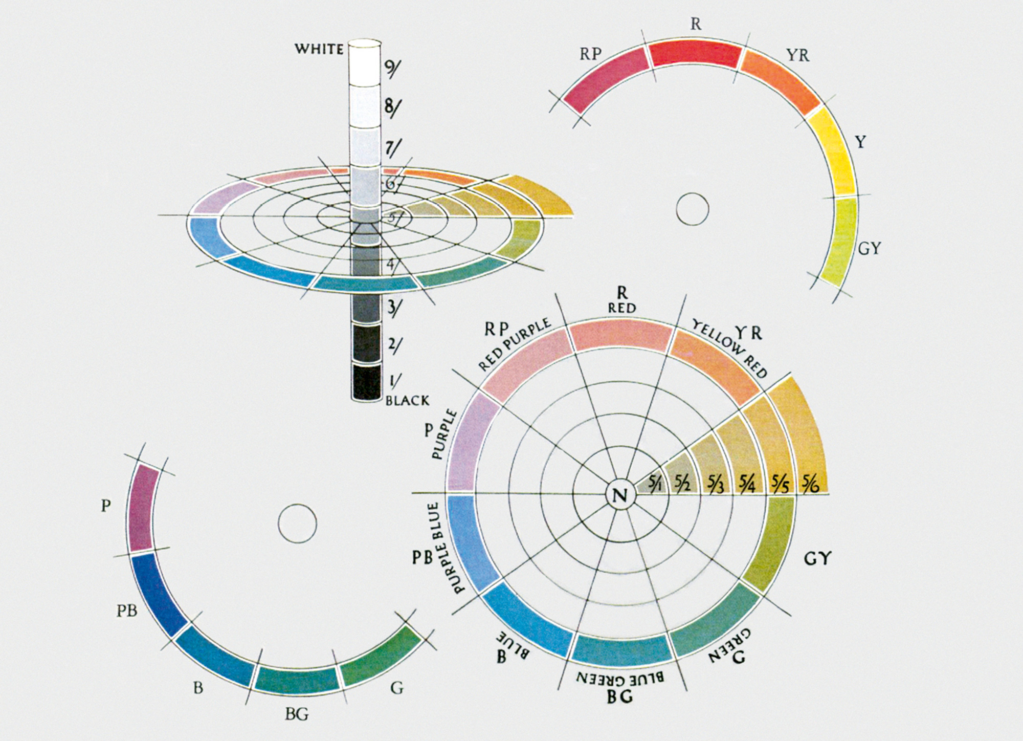
Such, anyway, was the opinion of Albert Munsell. By the time of his death in 1918, the American painter, art school professor, and color scientist had spent the better part of his life trying to devise a uniform and balanced scheme for the scientific classification and notation of color. Troubled by the apparent chaos and indefinitude of the English language’s treatment of color names, it was Munsell’s ambition to free the American people from the uncertainty of colloquial color language. Rather than having only a nebulous idea of what their fellow citizens meant when they used words like red and blue—let alone the ephemeral names of fashionable hues like crushed strawberry and elephant’s breath—users of the Munsell system would be able to relate their innermost chromatic experiences with confidence and exactitude. Only orange stood in his way. “Orange is an interloper,” Munsell declared in 1906, “and destroys balance.”
Munsell’s specific complaints about orange were twofold. For one thing, as he explained to readers of his 1905 book, A Color Notation, the word orange was “indefinite, and refer[red] to a variable product of the vegetable kingdom.” That is, it was too closely tied to a set of objects—the citrus fruits for which it was named, which themselves fluctuated wildly in orangeness from specimen to specimen—to truly stand for an ideal sensation. The same was true, for that matter, of indigo, which, at least among semantically fastidious scientists, had fallen out of favor as a color term, as well as violet—which had morphed into purple, ditching its association with the freewheeling floral world to become a more stately, abstract color term. (In actuality, purple retains much of its phonetic association with the regal garments called purpure from which it draws its sensual association. After purpure fell out of common use in the fifteenth century, the name remained as a descriptor for the color—a dissociation between object and adjective that did not occur with orange.)